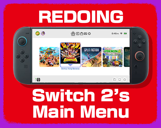
Switch 2 UI Rework (Mockup)
Made for a video on the Toxiquid YouTube Channel. Go check out the demonstration and design process!
This is NOT made for mobile users. Please use a computer. It will not load on your phone.
--------------------------------------------------------------------------------------------------------
CONTROLS
LEFT CLICK for EVERYTHING. to Scroll, use SCROLL WHEEL (trackpad compatible).
You can switch menus with a keyboard as well, using L or R.
--------------------------------------------------------------------------------------------------------
CREDITS
Toxiquid: Director, Animator, Graphic Design, Junior Programmer
Justan Oval: Lead Programmer, Godot Professor
Hypervolt: Musician
Godot Discord: Tech Support (thank you I had no idea what i was doing)
--------------------------------------------------------------------------------------------------------
CURRENTLY KNOWN BUGS
- when clicking between menus too fast, it glitches out. Not an issue with keyboard presses.
- 'Directly to You' Theme does not load.
Comments
Log in with itch.io to leave a comment.
beautiful, imagine someone mods the switch 2 to make it look like this
HOLY FART??!!!!
if i had a switch 2 i'd want this as my home screen
i saw the yt vid for a couple of months ago, forgot i could play it for fre
This is a BRILLIANT piece of portfolio! Congrats!
LET US MOD THIS PROJECT NOW
NINTENDO, HIRE THIS MAN!!!
Aww man I wanted the cool Zelda music on the theme like in the video :( otherwise this is amazing
nintendo please switch to this home menu
Nintendo has to see this. NOW!
Ehhh how to download
i love you and this
I wasn’t sure how I felt about the seamless design when watching the yt video but now that I’ve used it I can say I love the idea. The UI was so nice to navigate.
FR
it sucks i can't download this to make my own
true..
moving the white board from the app icons behind the game apps don't bring justice to the black text used, nintendo placed it behind the app icons to not flash the eyes with an overly used white wich also messes up the new 5 darkened app icons u placed since like the black text now has too much contrast relativly to the new overall brightness of the screen, speaking about these new 5 app icons, u chosed to size them up when selected (with a lil tweak on the texture asset) wich is not like the other buttons where they simply have a selection outline and i find it a little unprofesionnal just like coloring the game chat, shop and album app when they're open but not the home page and the settings one wich stays gray, for the settings the selected button shouldn't be filled with light blue, it's the currently opened tab one that should be, or you could also fix that by removing the selection outline on the one you select (actual better idea) just try selecting a button and remove your mouse pointer and you'll see what i mean, the shop otherwise has some good points like the added chill music, that stop after a while ? (loop it bro) and i agree the nintendo switch online icon really wasn't blending with the others icons in the home page but now that i see the home page without it i understand that it was one of the little marks of colors that really added to the peps of the menu, they really were the infinity stones. now the worse is really changing the overall color when you open the app since they still got these white bars at the top and under it, it just doesn't blend verywell, the contrast to strong once again. now let's talk about the pop-up that spawns when i press my profile, nintendo use that sort of pop-up window for notices or stuff like that but you decide to use it as a whole menu, never do that again (jk ofc u can, but i would not).
if i didn't mention a point, that means it doesn't bother me that much, and i forgor to say it's personnal opinion, somethings are made on purpose and they might be mistakes to me but not to the public or smth like that
still respect the gud work ma boi
(i tried looking professionnal for the baddies 😎)
man the sounds are so satisfying I wanna like uhhh yeah anyways...
If only 😞
lowkey need this on my nintendo rn.
much better then the regular switch or switch 2 menu
Please give us the source code-
Can u give us the godot project
Game Chat Enough Said
I heardthe clicks but not seing anything and im on mobbile
I'm sad😭
Read the description
I like how the time is accurate. How tf did you do that lol
can i play the games
no
I'm on windows and I've tried using Opera, Opera GX, Chrome, and Edge but all that comes up is "Error The following features required to run Godot projects on the Web are missing: WebGL2 - Check web browser configuration and hardware support"
i think it lacks that one low pitched sound effect for exemple when you exit a profile, similar to when you enter one
wen I got to the run mockup it was nomel until when it was done it crashed
it gives a white screen for me
is this on startup? what system are you running this on?
would love to diagnose the problem!
nevermind!
it just fixed itself
love this
This is amazing! I made a video on it. Check it out if you want :)
★☆☆☆☆ It crashed my computer :/
im so sorry to hear that! that is very very odd. can you tell me more about how this happened? this is the first i am hearing of my mockup crashing a system. do you have any error codes or anything like that? would love to diagnose this issue so it doesnt happen in the future.
I spent so long scrolling from side to side listening to the game sounds
Show post...
Nintendo Switch 2.1
This is incredible! I love just tinkering with the sounds and such!
This is so incredibly sick! Great job, man. I want to critique it a bit, but it's actually a really good proof of concept. That and I'm just some random on the internet, so I don't really have the grounds to be saying anything bad about it. Actual nice work, would love to see what you work on next!
i appreciate it! and feel free to critique. want to learn more about what im doing right and wrong so i can pivot in the correct direction, yeah?
Hey all! I hope you enjoyed the video (assuming that's where you came from).
This was a labor of love, but it's definitely not perfect. Please send any bug reports and we'll see if we can fix it! Would love to hear your thoughts :)